GNW Shop
Website Redesign
Project Overview
GNW is a Vancouver-based scene shop known for custom fabrication across museums, public art, film, and live events. The goal is to redesign a professional, distinctive website that showcases craft and credibility, avoids template patterns, and helps prospects contact GNW and request the portfolio with ease.
The Problem
• Generic structure & long scrolls: information was scattered; repeated sections reduced impact.
• Low CTA visibility: “Request Portfolio” and “Contact” weren’t consistently prominent.
• Unclear client pathways: Not-for-Profit (NFP) offering, gallery, and client lists lacked a clear narrative.
• Brand underplayed: the bold, industrial character of GNW’s craft didn’t come through in layout or tone.
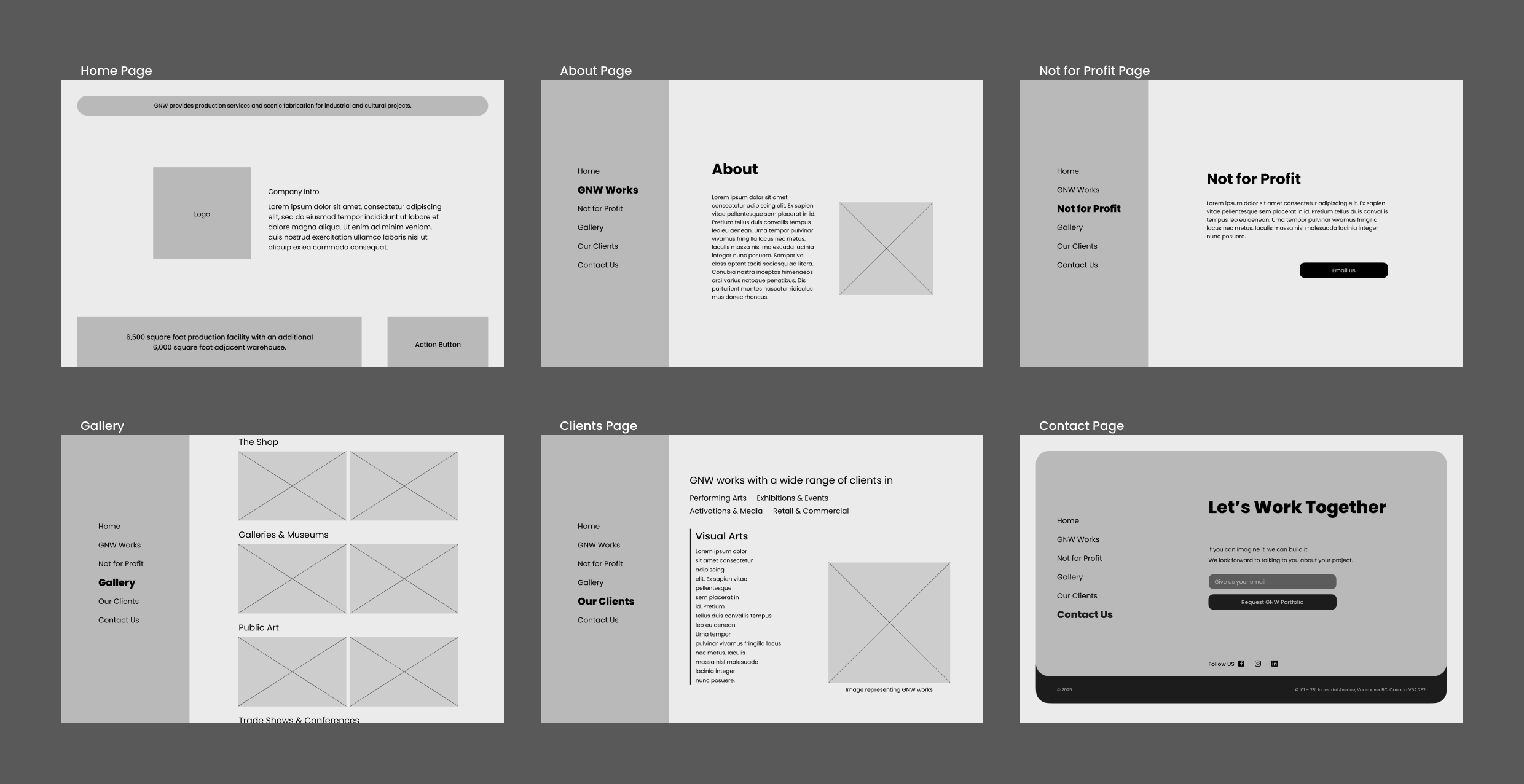
Wireframes & Ideation
Information Architecture - Wireframes
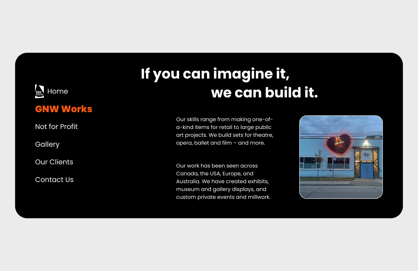
• Landing (short + decisive): Who GNW is, what they build, Explore GNW, Request Portfolio, Contact.
• GNW Works: Capabilities and process of GNW representing through their tagline “If you can imagine it, we can build it.
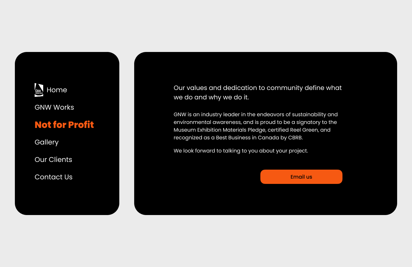
• Not-for-Profit: GNW’s community commitment with clear outreach path.
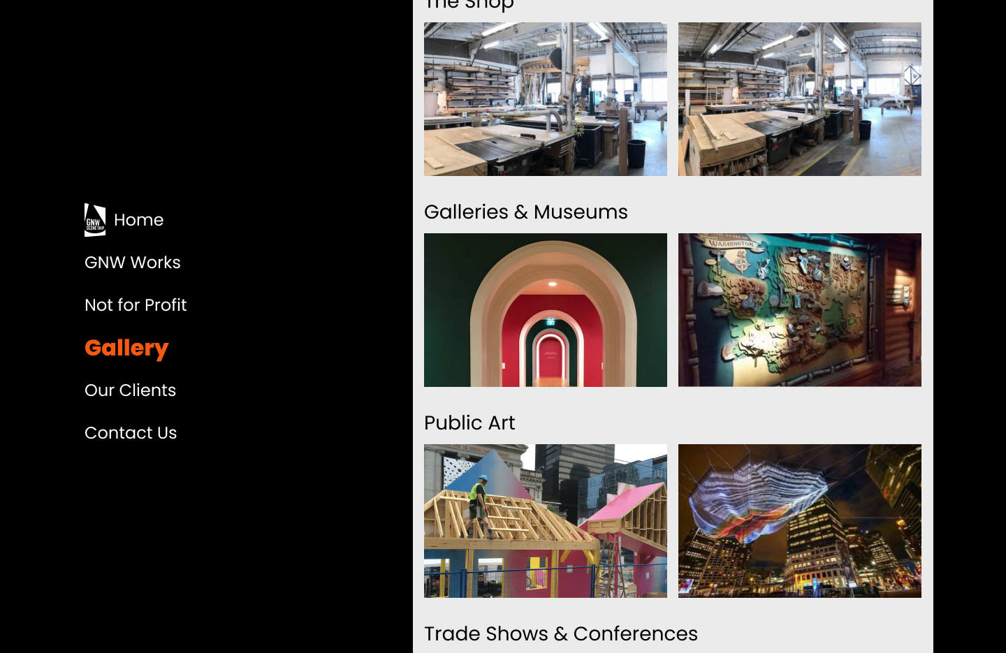
• Gallery: Project categories with fast visual scanning (Shop, Galleries & Museums, Public Art, Trade Shows & Conferences).
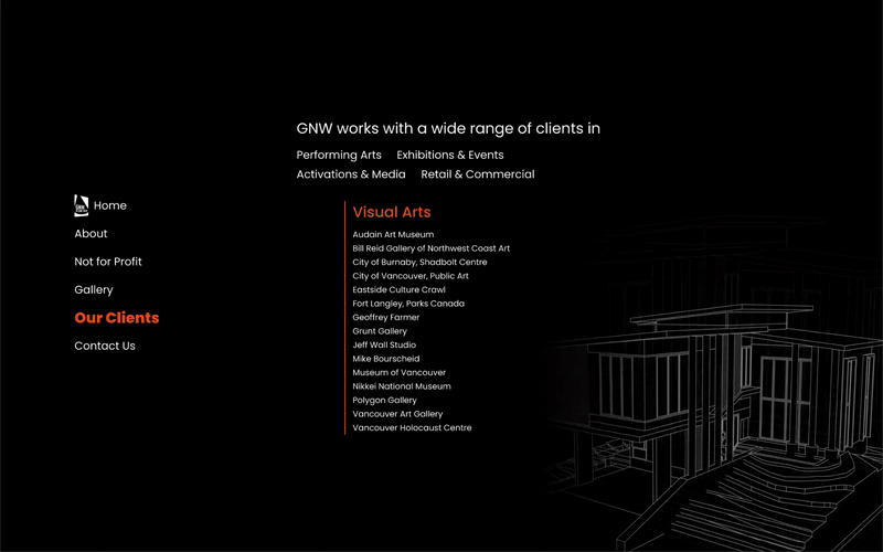
• Our Clients: Sector-grouped logos/names to reinforce trust at a glance.
• Contact: Single, distraction-free panel with form and direct contact details.
Brand & UI Kit
A strict requirement was to retain the existing brand during the redesign.
Using Poppins and orange as the centerpiece while elevating the overall experience.
Color System
A dark, bold, industrial base (near-black) with GNW Orange as the action and highlight color; white for content surfaces and contrast accents.
Typography
Poppins forclean, confident, and consistent with the brand; tight scale for headlines, generous line height for body.
Components
Rounded-corner blocks inspired by fabrication jig forms
A sticky side-navigation for subpages
Consistent CTA styling
Continuous image scrolling cards with crisp captions in gallery
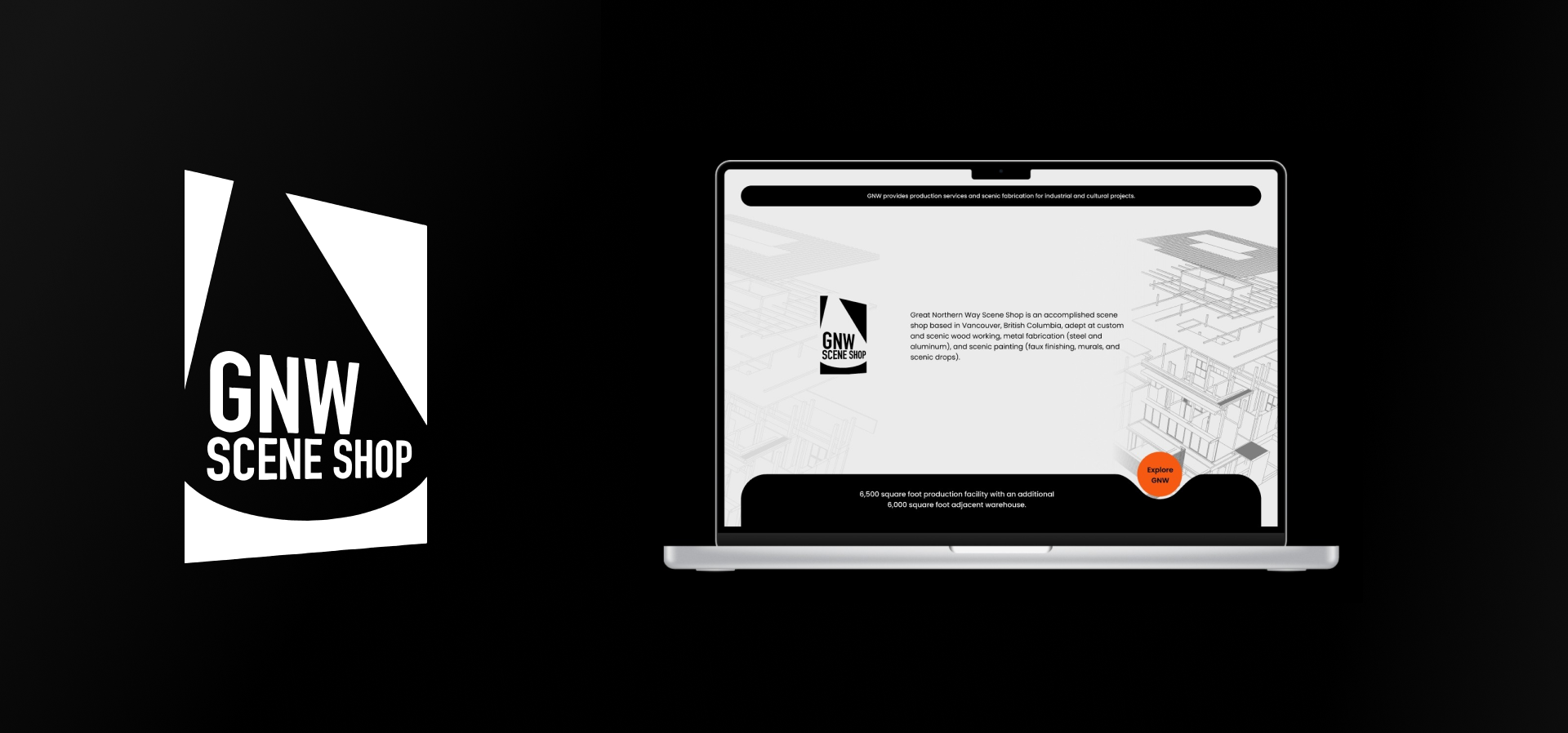
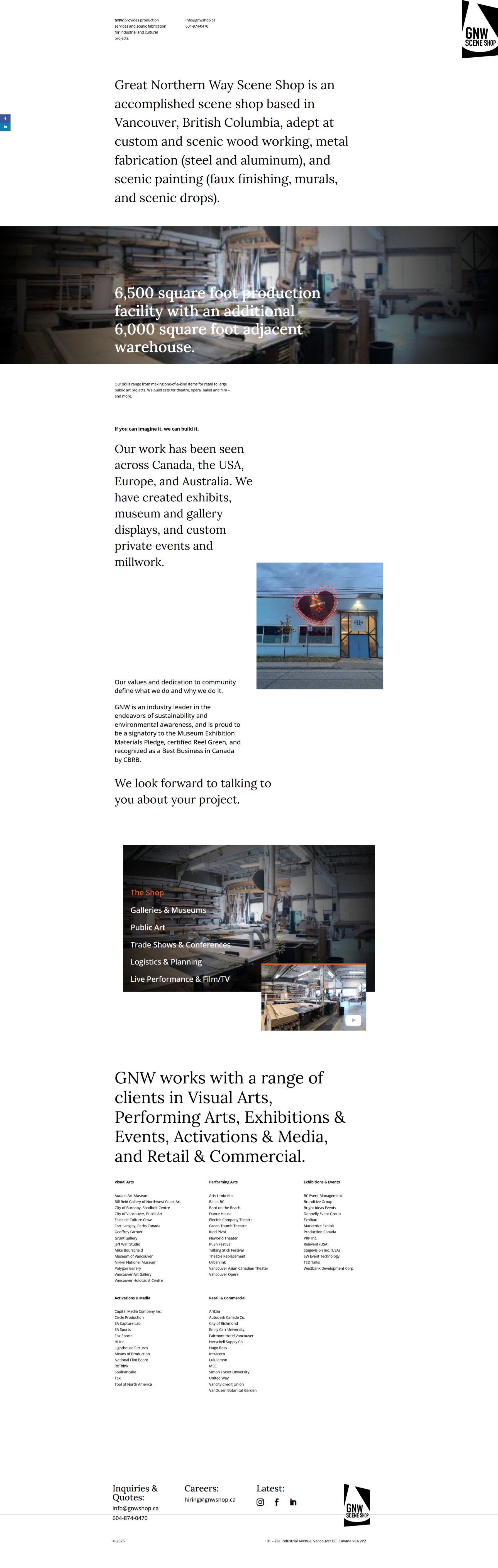
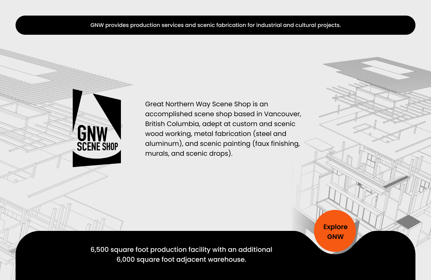
Final Solution - The Redesign
Landing
From long, generic scrolling to a short, high-impact entry with bold statement, facility stats, and immediate CTAs
Navigation
From mixed/duplicative sections to a clean primary nav and left rail on interior pages for quick orientation.
Not for Profit
Dedicated section with purpose statement and a friendly contact pathway—not intimidating for nonprofit partners.
Gallery
Grid of practice areas with large imagery; skim-friendly and quickly scannable.
A continuous image scrolling cards with crisp captions.
Ourclients
Sectorized lists that project scale and trust (“Visual Arts, Performing Arts, Exhibitions & Events, Activations & Media, Retail & Commercial”).
Added custom illustrations to enhance visual appeal and clearly convey the nature of work in each category.
Interactive Prototype
The experience is driven by purposeful motion and micro-interactions that guide attention, reinforce hierarchy, and keep users engaged throughout the site.